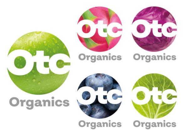
Brand-new corporate identity for OTC Organics B.V.
VV | OTC Organics B.V.
The company name of Organic Trade Company Holland B.V. (OTC-Holland) changed to OTC Organics B.V. and almost simultaneously company moved to new office in Dronten, The Netherlands. Now OTC Organics B.V. introduced a brand-new corporate identity.
Bart van der Vliet, Sales and Marketing manager shares that because of the growing ambitions and the associated new objectives, a new identity was a logical next step. A name change alone does not reflect what company stands for on a daily basis. Bart explains that a dynamic company such as OTC Organics also needs a new visual identity that increases company’s recognizability. The logo symbolizes the world of OTC Organics B.V. The circle, an organic shape, can be seen as a globe, which is filled with different kinds of fruit or vegetables from company’s wide range.
“This creates a rich palette that represents the extent of our product range. Our logo is not a fixed entity but changes, adapts and evolves depending on the environment and circumstances. Just like OTC Organics. The logo also focuses on our products: OTC Organics guarantees continuity through product knowledge and specialism. We know exactly what is needed for our suppliers and customers. Our specialism guarantees the chain”, - comments Bart van der Vliet.
He continues: “Our new logo also includes a new pay-off. Colorful in our range of products and activities, respected for our quality, expertise and investments in the areas of product development. OTC Organics is an organization that is keen to innovate and take its own course, but each decision is measured against the question: is that what we are doing, good for our chain partners and customers? In other words, we are: “Organic experts with a conscience!”
To learn more visit OTC Organics at Fruit Logistica (Berlin, February 6-8), Hall 3.2, stand B-07.
For more information:
OTC Organics B.V. (Sales team)
+31 (0) 885 880 400
sales@otcorganics.com
www.otcorganics.com


